



The transition toward renewable energy has made solar photovoltaic (PV) generation one of the fastest-growing sources of electricity worldwide. As solar plants scale up in size and geographic spread, operators face a new challenge: turning the continuous stream of inverter, weather, and grid data produced by these plants into timely, actionable insight. Business Intelligence (BI) dashboards provide an interactive platform for monitoring plant KPIs and diagnosing performance issues as they emerge, rather than after the fact.
Among all condition indicators available from a PV plant, inverter output, efficiency, and performance ratio are the most direct measures of plant health, while environmental variables such as solar irradiance, ambient and module temperature, humidity, wind speed, and cloud cover determine how much of the available sunlight is actually converted into usable power. Monitoring these together allows operations teams to distinguish genuine equipment issues from expected weather-driven fluctuations, and to react before minor inefficiencies compound into meaningful energy loss.
This project presents a Solar Photovoltaic Plant Performance Analytics Dashboard developed using Dashtera with InfluxDB2 as the backend. It is based on a solar power generation dataset extended into a continuously streaming live data source, simulating real-time telemetry from five inverters across a single plant. The streaming pipeline is deployed on an Oracle Cloud Always Free virtual machine, where a Python script runs continuously as a systemd service, reading the base CSV dataset and pushing data to InfluxDB Cloud 2 over HTTPS every second — with automatic restart on failure, ensuring the pipeline stays live around the clock.
The solution consists of three dashboard pages providing executive-level production insight, inverter performance and diagnostic analysis, and weather/environmental impact analytics through interactive KPIs and time-series, statistical, and 3D visualizations.
The dashboard’s foundational dataset was inspired by a publicly available solar power generation dataset:
Source: Solar Power Generation Data — Kaggle
The primary objective is to develop an interactive, near-real-time dashboard supporting operational decision-making by integrating inverter power output, plant efficiency, weather conditions, and grid quality data into one platform, enabling operators to monitor live production and identify performance issues as they occur.
Objectives:
The dashboard is organised into three pages:
The dashboard is powered by a live-streaming time-series dataset simulating a solar photovoltaic plant operating five inverters (INV_001–INV_005). The base dataset, inspired by a real-world Kaggle solar generation dataset, was extended with a Python streaming pipeline that continuously writes simulated telemetry into InfluxDB2 at one-second intervals, closely mimicking a live IIoT sensor feed.
Each record represents one reading from one inverter at a point in time, grouped under the solar_metrics measurement and covering the following categories of fields:
To emulate the imperfections of a real sensor network, the streaming pipeline introduces inverter-specific performance multipliers, small random variation in weather and power readings, occasional simulated communication loss per inverter, and a small probability (2%) of a warning-level alarm event. This produces a realistic mix of steady-state operation and intermittent anomalies for the dashboard to surface.
Stored in InfluxDB2, the dataset allows Dashtera to retrieve data via Flux queries scoped to short rolling time windows (10 seconds for live KPIs and gauges, 30 minutes for trend charts), with the database handling raw storage while aggregation and visualization logic are configured within Dashtera’s chart widgets.
Dashtera is a powerful no-code business intelligence platform that supports InfluxDB2-based time-series analytics and advanced visualizations.
Key Features
Advantages
This integration enabled continuous ingestion and visualization of live inverter telemetry, letting plant operators and engineers monitor production, detect abnormal inverter behaviour, evaluate weather sensitivity, and support operational decisions through one unified, auto-refreshing BI solution.
The Solar Photovoltaic Plant Performance Analytics Dashboard consists of three interactive pages that provide executive-level production insight, inverter performance and diagnostic analysis, and weather/environmental impact analytics. Together, these dashboards give plant operators and engineers a real-time understanding of production, equipment health, and weather sensitivity.
This page provides a real-time summary of plant production and status, designed for operators and managers needing an immediate view of how the plant is performing right now.
Three KPI cards anchor the page: Current AC Power and Current DC Power, each computed as a plant-wide mean over the last 10 seconds, alongside Data Points Ingested (5 Min) — a count of raw readings received across all inverters in the trailing five-minute window, serving as a simple but effective indicator that the live data pipeline is healthy and actively streaming.
Four gauge charts summarise operating condition at a glance: Average Inverter Efficiency and Performance Ratio, both plant-wide means with colour-banded thresholds (green for healthy operation, amber and red for degraded performance); Active Alarms, a live count of non-“None” alarm readings across the plant; and a comparative Ambient vs. Module Temperature view, letting operators quickly judge whether panel heating is within an expected range.
Six line and area charts track production and grid quality over different time horizons: Live AC Power Trend and Live DC Power Trend provide a short, fast-refreshing pulse of current generation, while the AC Power Trend (Last 30 Minutes) shows the broader trajectory of output. Energy Loss Trend, Grid Voltage Trend, and Solar Irradiance Trend complete the monitoring picture.
Two bar charts close out the page: Status Datapoints, showing the volume of readings by operating status (Running, Warning, Fault, Offline), and Inverter Data Points, showing the volume of readings contributed by each inverter.
This page moves beyond simple monitoring into correlation and multi-dimensional condition analysis, helping engineers understand why power output or efficiency is behaving the way it is — not just what the current values are.
A Linear Regression chart and a companion Point Chart, both plotting AC Power against DC Power, reveal the plant’s real-world conversion relationship: a tight, near-linear scatter indicates consistent inverter conversion efficiency, while any widening gap or outlier cluster points to conversion loss or an underperforming inverter.
Four 3D visualizations extend this diagnostic depth:
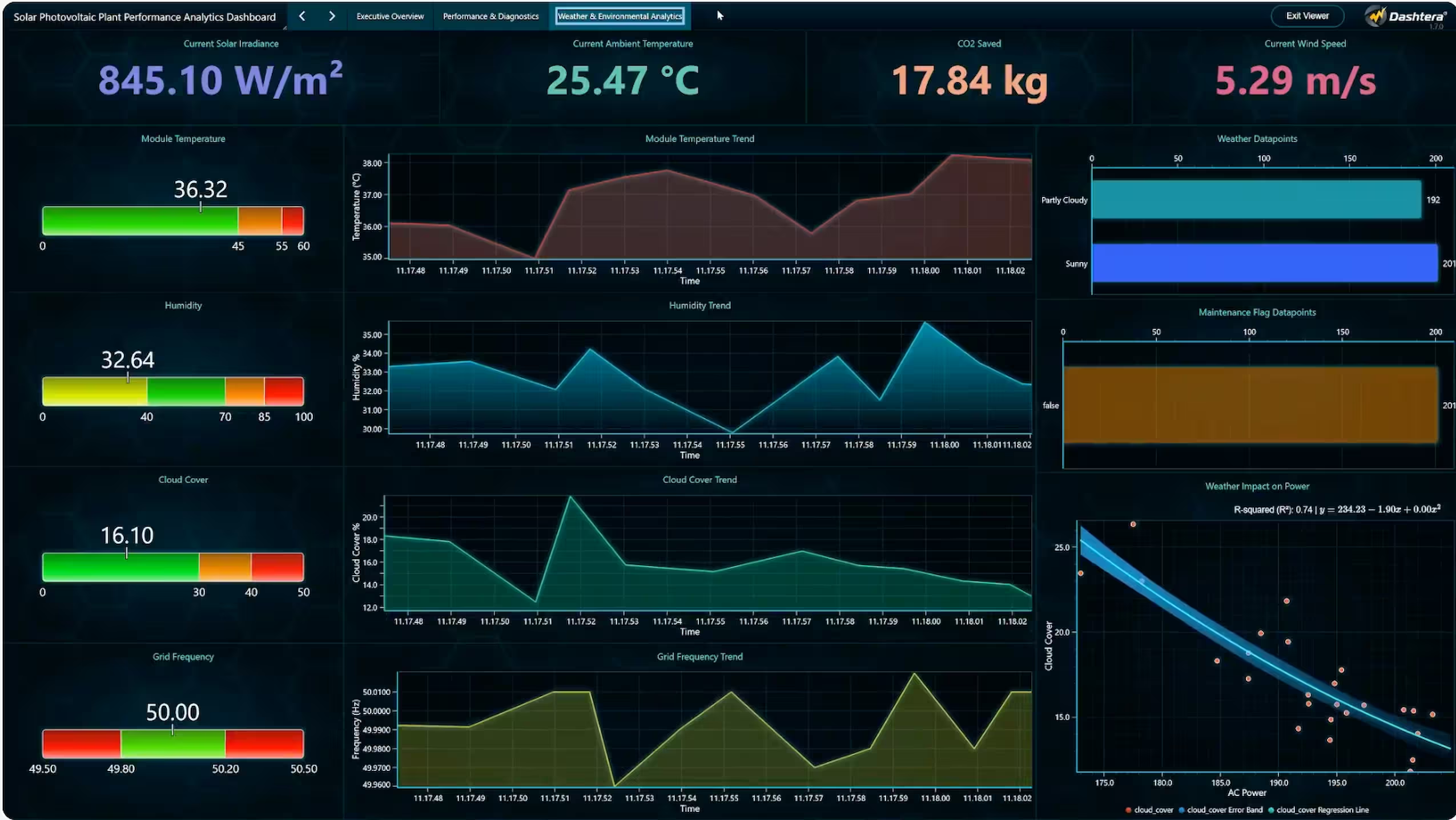
This page evaluates how environmental conditions shape plant output and contextualises the plant’s environmental contribution. Four KPI cards summarise current conditions: Current Solar Irradiance, Current Ambient Temperature, Current Wind Speed, and CO2 Saved — the latter translating live energy generation into an estimated environmental benefit figure.
Four gauge charts, each paired with its own 30-minute area trend chart, track conditions with operational or equipment-risk significance: Module Temperature, monitoring panel heat build-up; Humidity, colour-banded to flag conditions with elevated risk of condensation or corrosion; Cloud Cover, indicating how much available sunlight is currently being blocked; and Grid Frequency, monitoring grid stability against a tight 49.8–50.2 Hz healthy band.
Two bar charts show category distribution: Weather Datapoints, showing the volume of readings by weather condition (Sunny, Cloudy, Rainy), and Maintenance Flag Datapoints, showing the split between readings flagged for maintenance versus normal operation.
A regression chart — Weather Impact on Power plots AC power against cloud cover, directly testing whether cloud cover is a meaningful predictor of output loss. A clear negative slope confirms weather as a primary driver of generation variability; a flat or weakly correlated trend would instead point to other factors such as equipment condition or panel soiling as the dominant influence on underperformance.
Integrating live inverter telemetry, weather sensor data, and grid quality indicators into a single streaming BI platform gives operators a continuously updated view of plant health that a static report cannot match.
The Executive Overview delivers a quick operational snapshot — showing current power, active alarms, efficiency, and performance ratio, refreshed every few seconds. This supports immediate awareness instead of delayed, batch-style reporting.
The Performance & Diagnostics page shows the value of correlation and multi-dimensional visualization over simple trend lines alone. Relationships such as AC power versus DC power, temperature versus efficiency, and the combined view of irradiance, temperature, and power reveal patterns like thermal derating, conversion loss, and quality versus loss divergence that single-variable charts would miss.
The Weather & Environmental Analytics page confirms that environmental conditions strongly influence plant output. It also tracks grid quality, humidity-driven equipment risk, and sustainability metrics as separate concerns worth monitoring on their own.
A further practical finding relates to platform design: shifting aggregation and grouping from the Flux query into each chart widget’s own configuration proved to be a reliable pattern across all three dashboard pages, offering a useful reference approach for similar Dashtera and InfluxDB2 projects.
InfluxDB2 served as the primary time-series database for this project’s live telemetry stream, hosted on InfluxDB Cloud (eu-central-1-1.aws.cloud2.influxdata.com) under the Dashtera organization and the solar_photovoltaic bucket. The data pipeline begins with the solar_photovoltaic_live_data.csv dataset, read by a Python script (stream_to_influxdb.py) deployed on an Oracle Cloud Always Free VM (Oracle Linux).
Rather than running as an ad-hoc process, the script is managed as a systemd service (solar-stream.service), which starts automatically on boot and restarts the process if it exits unexpectedly, keeping the streaming pipeline running 24/7. The script applies per-inverter variability and simulated real-world conditions, then writes points to the solar_metrics measurement via the InfluxDB Python client over HTTPS at one-second intervals.
Dashtera connects directly to this bucket via Flux, with each dashboard widget issuing a short, tightly scoped query. KPI cards and gauges use 10-second windows, while trend and diagnostic charts use 30-minute rolling windows. Aggregation, grouping, and counting were handled through Dashtera’s widget-level configuration, giving flexible control over how each chart summarizes the underlying data.
This end-to-end pipeline — CSV source, always-on Oracle Cloud VM, systemd-managed streaming service, InfluxDB Cloud 2 storage, and Dashtera visualization — supports continuous ingestion and near-real-time visualization of streaming sensor data, offering a pattern that can be extended to additional inverters, additional plants, or a genuine IIoT sensor network without structural changes to the dashboard design.
This dashboard shows how live photovoltaic telemetry can be turned into meaningful, continuously updated BI. Built with Dashtera and InfluxDB2, and backed by a low-cost, always-on Oracle Cloud deployment running the streaming pipeline as a self-recovering systemd service, it gives plant operators and engineers a real-time understanding of production, equipment health, and weather sensitivity across three complementary pages: an operational pulse on the Executive Overview, correlation-driven diagnostics on Performance & Diagnostics, and environmental and sustainability tracking on Weather & Environmental Analytics.
Together, the KPIs, gauges, trend charts, regression analysis, and 3D visualizations demonstrate that a no-code platform — paired with a lightweight and resilient cloud deployment — can support real-time monitoring, root cause diagnosis, and weather sensitivity analysis in a streaming industrial IoT setting. The project shows how time-series data from a solar plant can be transformed into actionable insight, improving early fault detection, clarifying the relationship between weather and yield, and supporting timely operational decisions — while demonstrating that such a system can be run continuously and affordably using free-tier cloud infrastructure.
Dataset Reference
Idea Source: Solar Power Generation Data — Kaggle
Streaming Dataset: A live-streaming dataset generated for this project via a Python-based simulation pipeline (stream_to_influxdb.py), reading from solar_photovoltaic_live_data.csv and extending it with per-inverter variability, simulated communication loss, alarm events, grid quality metrics, and sustainability indicators, continuously written to InfluxDB Cloud 2.
Infrastructure: Organization: Dashtera | Bucket: solar_photovoltaic | Host: eu-central-1-1.aws.cloud2.influxdata.com | Measurement: solar_metrics | Cloud Compute: Oracle Cloud Always Free VM (Oracle Linux), running as systemd service solar-stream.service.
Share: