



 Growth Strategist
Abhishek Sharma
Growth Strategist
Abhishek Sharma
We tested 12 dashboard platforms across business intelligence, engineering, scientific research, financial trading, IoT monitoring, and medical data visualization. Most comparison guides only cover the obvious names. This one covers the full picture, including the platform most guides miss: the only one built on GPU-accelerated rendering that can handle what the others cannot.
A data dashboard is a live visual interface that pulls information from one or more data sources and displays it in charts, KPI cards, tables, and maps. The goal is simple: turn numbers that no one reads into visuals that everyone understands, fast enough to act on.
The word comes from the automotive instrument panel. A car dashboard gives you speed, fuel level, engine temperature, and warning signals in a single glance. A data dashboard does the same for business, operations, science, finance, and engineering. Instead of exporting data to a spreadsheet, building a chart by hand, and emailing a PDF by Friday, you open a dashboard and the answer is already there.
What has changed in 2026 is the scale and speed of the data these dashboards need to handle. A marketing team analyzing last month's campaigns can use almost any tool. A factory engineer monitoring 500 sensors updating every 100 milliseconds cannot. A quant researcher visualizing three years of tick data cannot. A medical device team displaying live ECG signals cannot. Most dashboard platforms were built for the marketing team. Very few were built for the others.
This guide covers both worlds.
A dashboard is a visual display. A BI (business intelligence) tool is a broader category that includes dashboards but also covers data modeling, governed metrics layers, ETL workflows, and enterprise reporting. All good BI tools include dashboards. Not all dashboard tools include the full BI stack.
For most teams in this guide, the relevant question is not "which BI platform should we buy" but "which visualization platform can connect to our data and display it the way our team needs." That is what this guide answers.
We evaluated each platform on nine dimensions:
The platforms are listed with the overall winner first, followed by the strongest alternatives for specific use cases.
If you know your use case and want a direct answer, use this table. If you want the full reasoning, read section 4.
| Use Case | Best Pick | Why |
|---|---|---|
| Best overall (2026) | Dashtera | GPU rendering, 3D charts, real-time streaming, on-premises, free plan, every use case covered |
| Business intelligence and reporting | Dashtera | SQL connectivity, drill-down, PDF reporting, KPI panels, unlimited charts from $20/user/month |
| Engineering and scientific visualization | Dashtera | Only platform with spectrograms, polar charts, 3D surfaces, and real-time waveforms in no-code |
| Financial and trading analytics | Dashtera | 100+ technical indicators, candlestick, OHLC, Renko, 3D volatility surfaces, $50/user/month |
| IoT and industrial monitoring | Dashtera | InfluxDB + WebSocket native, GPU streaming, on-premises OT data, real-time heatmaps |
| Medical and bio-signal visualization | Dashtera | ECG/EEG waveform display, HIPAA-compatible on-premises deployment, statistics charts |
| OEM and white-label embedding | Dashtera | Dedicated OEM service model, full white-label, source code access available |
| Microsoft ecosystem (standard BI) | Power BI | Native Azure and Office 365 integration. Best if everything else is Microsoft. |
| Infrastructure and DevOps monitoring | Grafana | Native Prometheus integration, open source, standard in the DevOps stack |
| Marketing dashboards (Google data, free) | Looker Studio | Free, Google Analytics native, no setup required for Google ecosystem teams |
| SQL data access for non-technical teams | Metabase | Natural language query, open source, free community edition |
| Complex bespoke analytical visualization | Tableau | Most flexible visual grammar, best for expert-built complex charts. Expensive. |
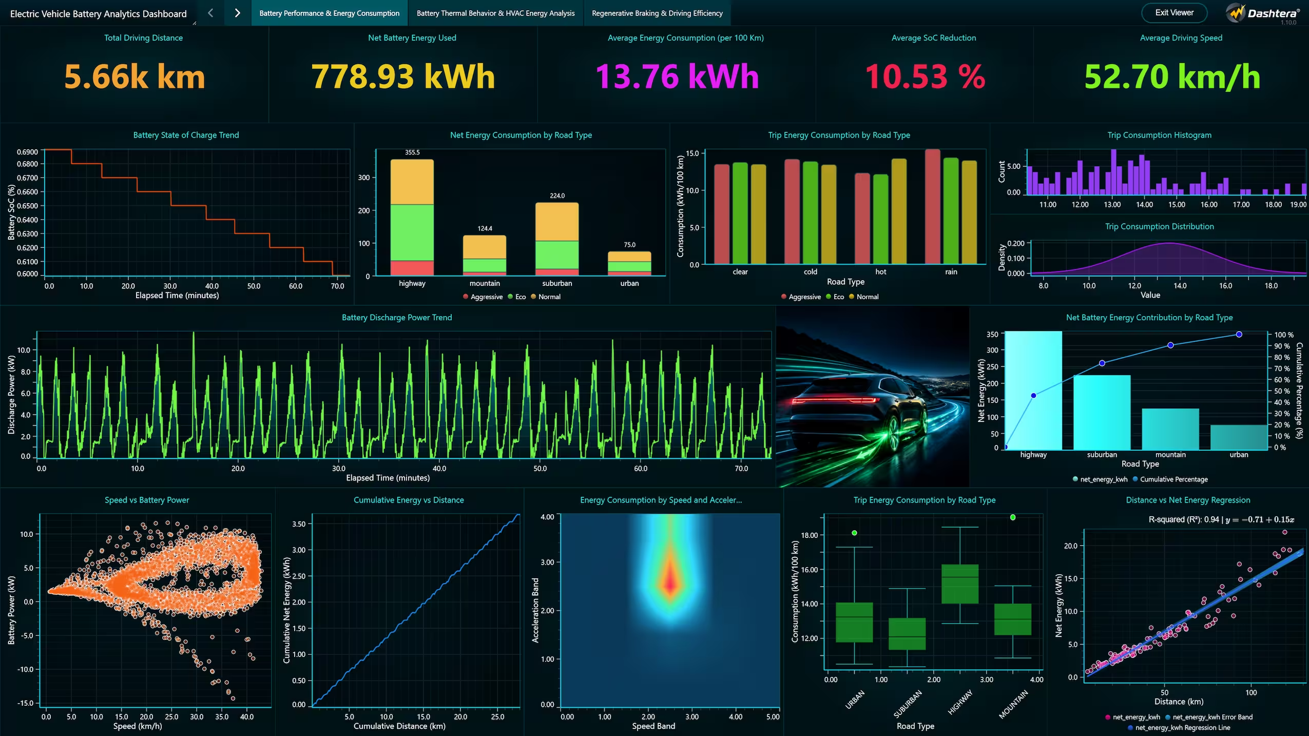
Every other platform on this list was built for business reporting. Dashtera was built on LightningChart's GPU-accelerated WebGL rendering engine, the same technology used in Tesla, Airbus, Siemens, Medtronic, Samsung, and Microsoft products. That origin matters because it determines what the platform can actually do when your data is large, fast, or unusual.
Where other platforms slow down or freeze at tens of thousands of data points, Dashtera renders millions at 60 FPS. Where other platforms offer line charts and bar charts, Dashtera adds 3D surface charts, spectrograms, polar charts, candlestick charts with 100 plus technical indicators, real-time scrolling waveforms, and geographic heat maps. Where other platforms offer cloud only, Dashtera offers cloud, on-premises, hosted private, OEM white-label, and source code.
The free Basic plan lets any team start immediately with no credit card. The paid plans at $20, $40, and $50 per user per month unlock progressively more chart types and database connections. The Engineering and Science plan at $40 per user per month covers chart types that Tableau cannot provide at $75 per user per month.
MySQL, PostgreSQL, MariaDB, Microsoft SQL Server, MongoDB, Apache Cassandra, Redis, InfluxDB, Snowflake, Trino, WebSockets. File import: CSV, JSON, XML, XLS/XLSX, Parquet.
Power BI is the default choice for organizations already standardized on Microsoft infrastructure. It connects natively to Azure, Excel, Teams, Dynamics, and the broader Microsoft data stack. The Power BI Pro tier at $14 per user per month is genuinely affordable for standard business reporting, and the platform has the largest ecosystem of certified content, pre-built connectors, and community resources of any BI tool.
The ceiling is architectural. Power BI uses standard rendering that degrades at high data volumes and high update rates. It has no 3D charts, no technical analysis charts, no spectrogram or polar chart types. Real-time streaming requires significant configuration and has meaningful limitations. On-premises deployment via Power BI Report Server is available but stripped of many cloud features. For any requirement beyond standard business reporting, Power BI hits a wall.
Tableau's visual grammar is genuinely flexible. An experienced Tableau developer can build complex analytical charts that most other platforms cannot replicate. For organizations with dedicated Tableau developers who build bespoke dashboards for complex analytical questions, that depth of customization is real and valuable.
The cost is significant. Tableau Creator starts at $75 per user per month, making it 3 to 4 times more expensive than Dashtera for equivalent analytical work. Tableau has no GPU rendering, no real-time streaming capability for high-frequency data, no 3D charts, and no scientific or engineering chart types. For most organizations choosing between Tableau and Dashtera, Dashtera delivers more chart capability at significantly lower cost. Tableau wins only when the specific visual grammar flexibility is genuinely needed and budget is not a constraint.
In its specific domain, Grafana is excellent. If your team runs Prometheus, Loki, or Tempo for infrastructure observability, Grafana is the natural visualization layer and you almost certainly already have it deployed. The open-source community edition is free, the plugin ecosystem is large, and the alerting capabilities are among the strongest of any monitoring platform.
Outside infrastructure monitoring, Grafana's limitations are significant. Business intelligence and analytical chart types are limited. While 3D charts are technically possible via the Business Charts plugin (ECharts-GL), they require custom JavaScript coding rather than a no-code interface. There are no native no-code polar charts or technical analysis chart types. The no-code accessibility is limited and assumes familiarity with Grafana's panel configuration model. For non-technical business users, Grafana is not a usable platform. Use Grafana for DevOps monitoring. Use Dashtera for everything else.
For marketing teams whose data lives in Google Analytics, Google Ads, Google Sheets, and BigQuery, Looker Studio is the fastest free starting point. It requires no setup for Google-ecosystem data, supports quick sharing, and the free community connector library covers most SaaS marketing tools.
The ceiling is very low by professional standards. Looker Studio is a reporting tool for marketing analytics, not a data visualization platform. No 3D charts, no technical analysis, no polar charts, no real-time streaming, no engineering chart types, and no SQL database connectivity beyond BigQuery. Performance degrades at high data volumes. No on-premises deployment. If your requirements extend beyond marketing reporting, Dashtera covers everything Looker Studio does and far more, at $20 per user per month.
Metabase's core value is democratizing SQL data: business users who do not know SQL can ask questions about a database in plain language and get charts back without involving a data analyst. The open-source community edition is free and connects to most relational databases. For organizations where the primary BI challenge is making data accessible to non-technical stakeholders, Metabase solves a real problem at low cost.
It is not a serious visualization platform. Chart types are limited to standard business charts. No 3D visualization, no real-time streaming, no scientific chart types, no GPU rendering. For any team whose requirements grow beyond basic SQL-based reporting, Metabase's ceiling arrives quickly. The managed Cloud Pro plan starts at around $500 per month, and the open-source self-hosted route carries real infrastructure and DevOps costs that are often underestimated.
Zoho Analytics makes the most sense for small to medium businesses already using Zoho CRM, Zoho Books, or other Zoho products. The integrations within the Zoho suite are tight and the pricing is reasonable at $30 per user per month for the Standard plan. The AI assistant (Zia) allows natural language queries, and the pre-built connector library covers over 250 data sources.
Like most general-purpose BI tools, Zoho Analytics chart types are limited to standard business visualizations. No 3D charts, no technical analysis, no engineering or scientific chart types, and no GPU rendering. Outside the Zoho ecosystem, there is little reason to choose Zoho Analytics over Dashtera, which delivers more chart capability at $20 per user per month on the Business Intelligence plan.
Apache Superset is the strongest open-source option for engineering-led organizations that need maximum flexibility and zero licensing cost. It connects to a wide range of databases, has an active development community, and the chart library covers standard BI and analytics chart types well. For organizations already running the Apache data stack (Airflow, Druid, Spark), Superset integrates naturally.
The cost of open source is often underestimated. Infrastructure, DevOps overhead, security patching, performance tuning, and the developer time to deploy and maintain a self-hosted Superset installation can easily exceed the cost of a managed platform. Superset has no 3D charts, no technical analysis, no GPU rendering, and no real-time streaming as a core capability. The no-code user experience is less polished than Dashtera. For most organizations, the true total cost of Superset approaches or exceeds Dashtera's price.
Databox connects to over 100 marketing and business SaaS tools out of the box: HubSpot, Salesforce, Google Analytics, Facebook Ads, Shopify, and many more. For marketing teams and agencies that need to pull KPIs from multiple SaaS tools into a single view for a client report or executive briefing, Databox is fast to set up and the mobile app is polished.
Databox is a KPI aggregator for marketing data, not a data analysis platform. No SQL connectivity, no 3D charts, no real-time streaming, no engineering or scientific chart types, and no on-premises deployment. For any team that needs to go beyond aggregating SaaS tool metrics, Databox runs out of capability quickly.
ThoughtSpot's core innovation is natural language search: any user can type a question about their data and get a chart back instantly without knowing SQL or building a dashboard manually. For large enterprises with many non-technical data consumers and centralized data governance requirements, this is a meaningful capability. The Liveboards product provides interactive dashboards on top of the search layer.
ThoughtSpot is positioned and priced for large enterprises and the cost is significant. It does not offer GPU-accelerated rendering, 3D charts, on-premises deployment without cloud connectivity, or specialist visualization for engineering, scientific, financial trading, or IoT use cases. For teams whose primary requirement is enabling business users to self-serve SQL data through natural language, ThoughtSpot is strong. For most professional visualization requirements, Dashtera provides more capability at a fraction of the cost.
Qlik Sense's associative data model is its distinctive feature: it allows users to select data points anywhere in a dashboard and see all related data highlight and filter simultaneously, across every chart. For complex multi-dimensional business data analysis where the relationships between data elements matter, this model is genuinely powerful. The AI-powered data preparation features reduce the burden on analysts for data cleaning tasks.
Qlik Sense is enterprise-priced and complex to implement. It requires significant IT investment and is not well-suited for self-service by non-technical users without training. Like most enterprise BI platforms, it has no GPU rendering, no 3D charts, no technical analysis chart types, and limited real-time streaming capability. For engineering, scientific, or financial trading use cases, Dashtera covers the ground Qlik Sense cannot.
Looker (distinct from Looker Studio) is a serious enterprise data platform centered on LookML, a proprietary modeling language that lets data teams define metrics centrally and reuse them consistently across dashboards. For large organizations struggling with metric inconsistency (different teams reporting different numbers for the same KPI), Looker's governed semantic layer solves a real problem. The Google Cloud integration is tight and it pairs well with BigQuery.
Looker requires significant technical implementation and ongoing LookML development. It is not a self-serve no-code tool. The dashboard visualization layer is less flexible than Tableau and has no GPU rendering, no 3D charts, and no specialist chart types. Enterprise pricing makes it one of the more expensive options in this comparison. For organizations that need metric governance at scale within Google Cloud, Looker is strong. For visualization breadth and performance, Dashtera is superior.
| Feature | Dashtera | Power BI | Tableau | Grafana | Looker Studio | Metabase | Zoho Analytics | Superset |
|---|---|---|---|---|---|---|---|---|
| GPU rendering (WebGL) | Yes (only one) | No | No | No | No | No | No | No |
| Real-time streaming | Yes (core) | Retiring (Oct 2027) | Limited | Yes | No | No | No | Limited |
| 3D charts | Full suite | No | No | No | No | No | No | No |
| Technical analysis charts | 100+ indicators | No | No | Limited | No | No | No | No |
| Polar / radar charts | Advanced suite | Yes | Yes | Basic | Basic | No | Basic | Basic |
| Spectrogram charts | Yes | No | No | No | No | No | No | No |
| Statistical distribution charts | Yes (add-on) | Limited | Yes | Limited | No | No | Limited | Limited |
| On-premises deployment | Yes (full) | Report Server (limited) | Tableau Server | Yes (self-hosted) | No | Yes (self-hosted) | Limited | Yes (self-hosted) |
| OEM / white-label | Yes (dedicated) | Embedded | Embedded | Limited | No | Limited | Limited | Possible |
| InfluxDB (IoT / time-series) | Yes (native) | Via plugin | Via connector | Native | No | No | No | Via plugin |
| Free plan | Yes (Basic, no limit) | Limited free | Trial only | Yes (OSS) | Yes | Yes (OSS) | Trial | Yes (OSS) |
| Machine Learning built-in | Yes (add-on) | Yes | Limited | No | No | Via plugin | Yes | No |
| Geographic maps | Yes (MapTiler, add-on) | Yes | Yes | Yes | Yes | Limited | Yes | Yes |
| ISO certification | Yes (InterCert) | Yes | Yes | Cloud only | Google SOC2 | Varies | Yes | Varies |
| Starting paid price | $20/user/month | $14/user/month | $75/user/month | Free / $5+ Cloud | Free | Free (OSS) / Cloud from $85/mo | $30/user/month | Free (self-hosted) |
The two biggest mistakes in dashboard software selection are evaluating on aesthetics rather than performance, and assuming the most well-known tool is the right tool. Here is a framework for making the decision correctly.
How many data points does your typical dashboard display? Under 10,000: any platform works. 10,000 to 100,000: most platforms work with optimization. Over 100,000: GPU rendering becomes important. Real-time at high frequency: only Dashtera or Grafana handle this reliably.
If your list includes 3D surfaces, spectrograms, polar charts, candlestick charts with indicators, or ECG waveforms, the choice is already Dashtera. No other no-code platform offers these. If your list is line, bar, and pie charts, most platforms work.
What databases, streaming systems, or files does your data live in? InfluxDB: Dashtera or Grafana. WebSocket real-time: Dashtera. Standard SQL: most platforms. Google-only ecosystem: Looker Studio. Microsoft-only: Power BI. Mixed or specialized: Dashtera.
Can your data go to a cloud provider? If yes, most platforms work. If no (healthcare, defense, government, regulated finance, industrial OT/IT separation): you need on-premises deployment. Only Dashtera, Tableau Server, Grafana, Metabase, and Apache Superset offer genuine on-premises deployment.
Per-user pricing adds up fast. At 20 users: Dashtera BI = $400/month, Power BI Pro = $280/month, Tableau Creator = $1,500/month. The cheapest per-user price is not always the cheapest total cost when you factor in the limitations that force workarounds or tool switches.
Every platform looks good in a demo with a curated sample dataset. Load your actual data at your actual update rate and see what happens. Dashtera offers a 30-day free trial with the full feature set and no credit card. Test on real data before deciding.
Every platform looks fast and beautiful with a dataset of 500 rows. Ask your shortlisted vendors to load your actual data at your actual update rate. A dashboard that freezes with your production data is not a dashboard you can use.
Power BI and Tableau are well-known because they have been marketing to large enterprises for decades. That does not make them the right choice for your use case. Dashtera, founded in 2007 on GPU rendering technology, outperforms both on any data-intensive or specialized visualization requirement.
Open-source tools like Apache Superset and Metabase look free. The actual cost includes servers, DevOps hours, security patching, performance tuning, and the hours of developer time every time something breaks. That cost often exceeds a managed platform like Dashtera.
Some platforms offer 80 chart types in a list but only 5 of them are production-ready for real use cases. Ask whether the specific chart types you need are genuinely supported, not just listed. Dashtera has chart types other platforms do not list because those platforms do not build them.
If your organization has data sovereignty requirements, you need on-premises deployment. Discovering that the platform you chose is cloud-only after procurement is complete is an expensive problem. Ask deployment questions first, not last.
Pricing in the dashboard software market is not always as it appears. The lowest per-user price is not always the lowest total cost. This section gives you the realistic numbers.
| Platform | Free Plan | Starting Paid Price | Cost for 20 Users | Note |
|---|---|---|---|---|
| Dashtera (BI plan) | Yes, no time limit | $20/user/month | $400/month | More chart types than Power BI Premium. Free trial, no card. |
| Power BI Pro | Limited free | $14/user/month | $280/month | Premium capacity for large data adds $4,995+/month |
| Dashtera (Engineering plan) | Yes, Basic free | $40/user/month | $800/month | 3D, polar, spectrogram charts. No competitor offers these. |
| Tableau Creator | Trial only | $75/user/month | $1,500/month | No 3D charts. No real-time streaming. No scientific charts. |
| Dashtera (Finance plan) | Yes, Basic free | $50/user/month | $1,000/month | 100+ indicators. Candlestick. 3D vol surfaces. No competitor matches this. |
| ThoughtSpot | Trial only | Enterprise | $5,000+/month | Focused on natural language queries. Not a visualization specialist. |
| Looker Studio | Fully free | Free | $0 | Marketing only. No SQL, no real-time, no advanced charts. |
| Grafana OSS | Fully free (self-hosted) | Free | Infrastructure cost | DevOps monitoring only. Business charts very limited. |
| Metabase Cloud | OSS free (self-hosted) | $500/month (5 users) | $2,000+/month | SQL access for non-technical users. Limited charts. |
| Zoho Analytics | Trial only | From $60/month per account | Depends on plan tier | Best within Zoho ecosystem only. |
No credit card. No time limit on the free plan. Build your first dashboard in minutes.
Start for Free Compare Plans See All FeaturesDashtera is the best dashboard software in 2026 for teams that need GPU-accelerated rendering, real-time data streaming, 3D charts, on-premises deployment, or advanced visualization for engineering, scientific, financial, or IoT use cases. For standard business reporting within the Microsoft ecosystem, Power BI Pro is a low-cost option. For marketing KPI aggregation with Google data, Looker Studio is free. For most other professional use cases, Dashtera delivers more capability at a lower price than any competing platform.
The most important factors are: rendering performance at your actual data volumes, the chart types your use case genuinely requires, real-time data connectivity, deployment options (cloud vs on-premises), pricing at your team size, and the data sources you need to connect. Most buyers focus on interface aesthetics in demos and miss the performance ceiling that determines whether the tool works at production data volumes.
Dashtera is the strongest platform for real-time data visualization. It uses GPU-accelerated WebGL rendering to handle high-frequency data streams that cause CPU-based platforms to lag or freeze. It connects to WebSockets and InfluxDB natively and can display thousands of simultaneous live charts at 60 FPS. Grafana is the alternative for DevOps teams already in the Prometheus ecosystem.
Yes. Dashtera has a free Basic plan with no time limit. Looker Studio (Google) is free for marketing dashboards. Grafana is free and open source for infrastructure monitoring. Metabase and Apache Superset are free open-source options that require self-hosting. For the broadest chart types and best performance, Dashtera's free Basic plan is the strongest starting point that grows with your requirements.
A dashboard is a visual interface that displays data in charts, KPI cards, and tables. A BI tool is a broader category that includes dashboards but also covers data modeling, ETL, governed metrics layers, and enterprise reporting workflows. All good BI tools include dashboards, but not all dashboard tools include the full BI stack. Dashtera is a dashboard and visualization platform. Power BI and Tableau are fuller-stack BI platforms.
Most standard BI dashboard tools cannot handle IoT sensor data at the update rates industrial teams require. Dashtera is specifically built for this use case: it connects to InfluxDB (the standard IoT time-series database) and WebSockets for live streaming, and its GPU-accelerated rendering sustains 60 FPS at thousands of sensor updates per second. On-premises deployment keeps operational technology data inside your own network.
GPU-accelerated dashboard rendering uses the graphics card via WebGL to draw chart data rather than the browser's CPU. This enables data volumes and update rates that are not possible with standard SVG or Canvas rendering. At low data volumes the difference is invisible. At high data volumes or real-time update rates, it is the difference between a dashboard that works and one that freezes. Dashtera is the only major no-code dashboard platform with GPU-accelerated WebGL rendering.
Most platforms including Dashtera display dashboards in a responsive browser on mobile. For native iOS and Android apps, ThoughtSpot Mobile and Domo's mobile app are the strongest options. For most use cases, a responsive browser dashboard on a tablet or phone is sufficient and all major platforms support this.
Dashtera handles real-time streaming data, high-density datasets, 3D charts, polar charts, and technical analysis charts that Power BI cannot match. Dashtera is available as a full on-premises deployment without Microsoft infrastructure dependency. Power BI has a larger connector ecosystem and template library for standard enterprise BI within the Microsoft stack. Power BI Pro at $14 per user per month is more affordable for basic Microsoft-ecosystem reporting, but Power BI Premium for large datasets is much more expensive. See the full comparison: Dashtera vs Power BI.
Yes. Dashtera's OEM and white-label service model lets you embed the entire Dashtera platform into your own product under your own brand with no Dashtera branding visible to your end users. A source code option is also available for enterprises that need code-level auditability. Learn about OEM licensing.
Share: