Once you know what Dashtera is, the natural next step is getting your own data into it. This tutorial walks through the four fundamentals every dashboard is built on: importing files, binding data to a chart, working with functions, and creating a custom dataset. Each one uses the same drag-and-drop, code-free workflow, so by the end you’ll be able to go from a raw file to a live, calculated visualization without writing a single line.
1. How to Import Files
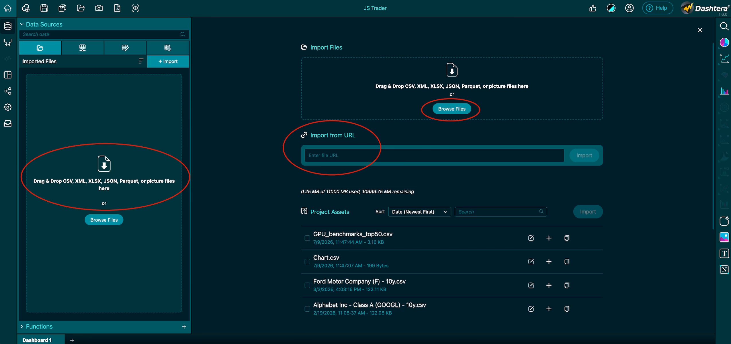
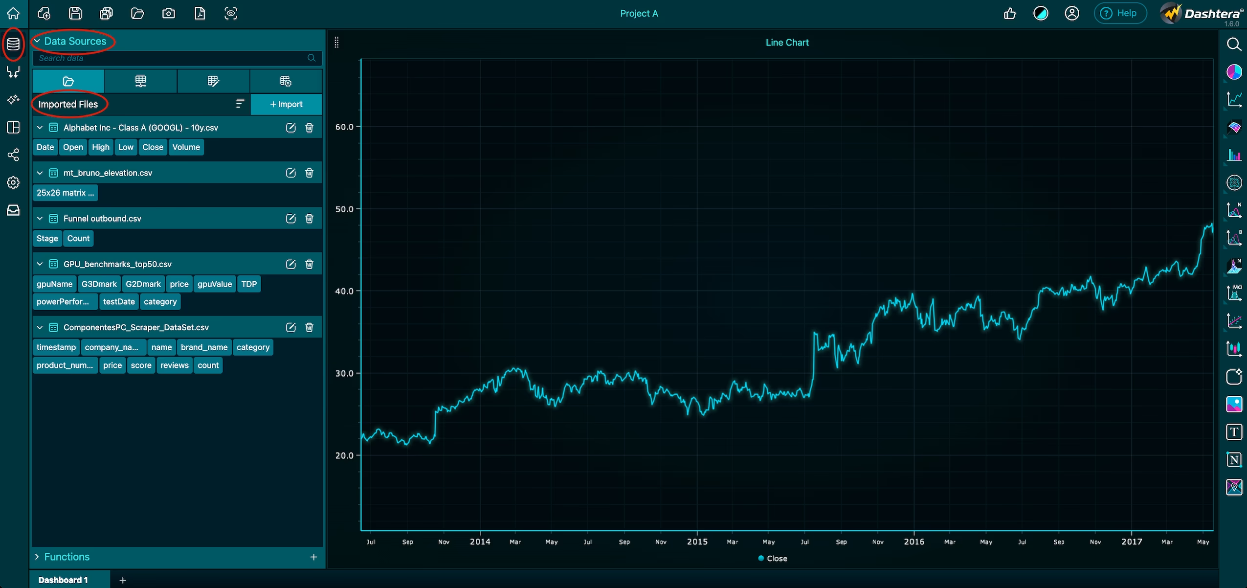
Dashtera offers a highly intuitive interface for importing data from multiple sources. You can bring in datasets three ways:
Drag and drop a file straight onto the interface
File selection through a standard file picker
Import from a URL, pulling data directly from a web address
Once a file is selected, Dashtera intelligently detects data types and opens a user-friendly import dialog for quick adjustments before anything hits your dashboard.
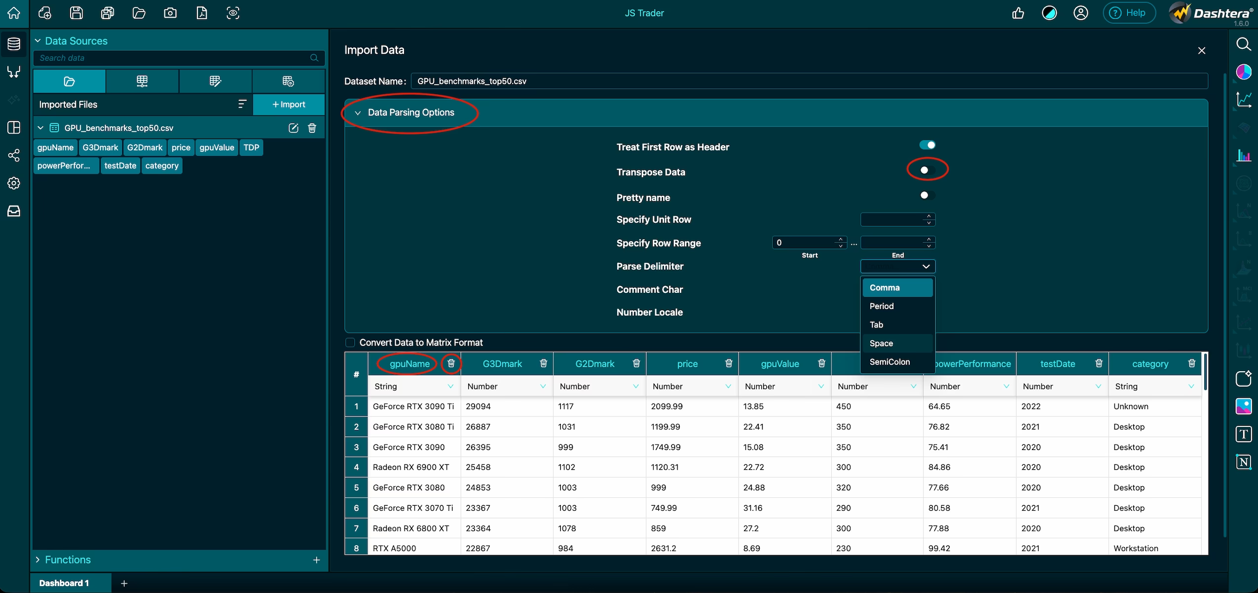
Adjust the schema on import
The import dialog lets you shape the dataset before importing it. From here you can:
Select the schema and skip specific rows or columns
Delete unnecessary data
Transpose the dataset so rows become columns and vice versa
For trickier files, advanced parsing options give you finer control including delimiter configuration, number formatting based on locale, and more.
How Dashtera reads your data
It helps to know how Dashtera structures what you import: each row is treated as an individual record, while columns represent attributes. Those columns are what you’ll link directly to charts, functions, and dashboards later on. With the file imported, your data source is saved and ready to map to a chart.
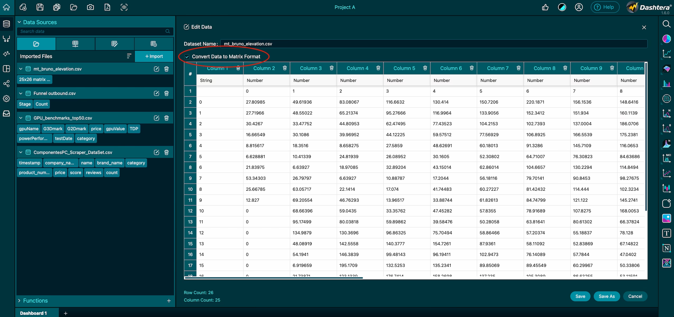
Importing matrix data for advanced visuals
For more advanced analytical needs, Dashtera also supports importing data in a matrix format. This is ideal for powering complex visualizations such as heat maps and 3D surface charts, where the data naturally forms a grid rather than a simple list of records.
2. Data Binding to a Chart
With your data imported, binding it to a chart is where the visualization comes to life — and it’s quick, intuitive, and completely code-free.
Open the Data Source panel
On the left-hand navigation bar, click the Data Source tab. This opens a panel that displays everything available to you: imported files, data connectors, and data generators. From here you can preview datasets, explore columns, and get ready to map them to your chart.
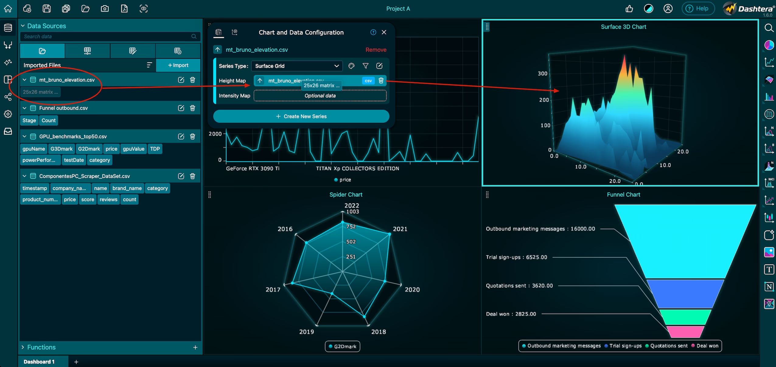
Bind columns to the chart
First, make sure the chart you want to populate is already added to the dashboard. Then:
Find the column you want in the Data Source panel.
Drag that column onto the corresponding input field of the chart.
Drop it — your chart updates instantly with the mapped data.
That’s the whole loop. Repeat it for each input the chart needs (for example, X and Y values), and the visualization fills in as you go.
Use data generators for dynamic values
You don’t always need a file to start building. Dashtera includes data generators that create dynamic values for your charts. Just drag and drop the required generator and define the range for the data. Generators are a great time-saver — they let you populate a chart and streamline your build with just a few clicks, which is especially handy while prototyping a layout.
3. How to Work with Functions
Dashtera’s Functions capability, also found on the left navigation bar, lets you perform dynamic data transformations before the results are visualized in a chart. Instead of pre-processing your data elsewhere, you connect pre-built functions directly into your workflow with the same drag-and-drop approach.
Connect a function to a chart
Select a function from the built-in list of functions.
Drag and drop columns from your data source into the function’s inputs.
The function processes the data and returns a calculated result, ready to feed into your chart.
The result is a live transformation: your chart reflects the calculated output rather than the raw numbers, and it stays connected to your source data.
4. How to Create a Custom Dataset
Alongside importing files, using data connectors, and generating data, Dashtera lets you build a custom dataset from scratch with a designated data source name tailored to exactly what you need.
Define and fill your dataset
You can define a dataset with any number of rows and columns, added conveniently using the plus (+) button. Each column supports a range of data types, including:
String
Number
Time
Date & time
Set up your rows and columns, choose the right data type for each, and enter your values directly.
Save, export, and keep editing
Once the dataset is configured, you have a few options:
Export the data source in both CSV and JSON formats for external use.
Save it — after which it’s immediately available for mapping to charts, just like any imported file.
Keep editing it: the dataset remains fully editable, so you can make ongoing modifications whenever your needs change.
Putting it all together
These four skills stack neatly: import (or create) a dataset, bind its columns to a chart, and optionally run those columns through a function to transform them along the way. Because every step uses the same drag-and-drop interface, moving from raw data to a polished, calculated visualization stays fast and code-free.
Ready to try it yourself? Start building for free at dashtera.com.